United Airlines | 2020
Envision and implement a practical and economical “Touchless Check-in” experience that would minimize the risk of customer and agent exposure to the 2019 novel coronavirus.
My responsibilities as product strategist and designer on the project included the following:
Identified new problems to solve within the day-of-travel customer journey, accepted a paradigm shift in traveler needs, and reacted to a new COVID-19 world
Ideated for economical, scalable, and high-impact solutions
Designed and strategized vision and implementation of “Touchless Check-in”
Pitched proposal to digital products and airport strategy leadership
Designed new user interfaces across the United mobile app and airport kiosks
Worked with a cross-functional group across several bureaucratic silos to plan rollout of phase 1 for a mid-May 2020 release
In late March of 2020, United was largely in denial about the severe impact COVID-19 would have on the travel industry. Air traffic had reached a historic high in 2019, and many company executives believed—or wanted to believe—we’d return to business as usual after a few months. Because of that status-quo thinking, the company remained committed to their concept of innovation: creating more efficient check-in processes in the lobby, seeking solutions for crowded gates, reducing long lines and customer dependence on agents when flights were canceled or delayed, etc.
Overnight, however, United's stock went into free fall and YoY air traffic dropped dramatically . In the first two weeks of April 2019, United flew over 6,000,000 travelers. During the same period in 2020, United flew fewer than 200,000. It became clear that the company’s definition of innovation was now outdated.
I believed we needed to focus on increasing customer confidence about air travel. In many respects, this was out of our control. The virus would need to be contained before bookings would rebound. But there were still those who needed to travel. I began to ask myself, how could we, as a company, do our part in minimizing a customer and/or employee’s exposure to the virus? To do this and to reduce customer anxiety at the airport, we needed to implement new safety measures and make infrastructural changes as soon as possible.
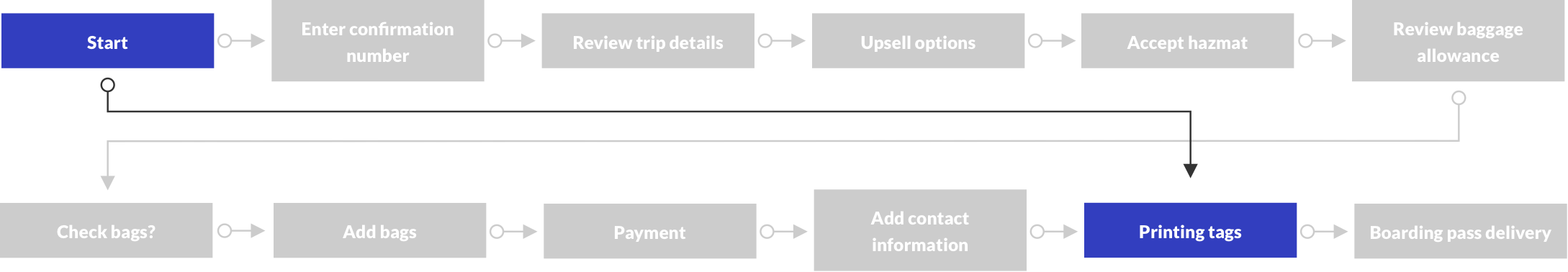
At the time the coronavirus was declared a pandemic, United’s check-in experience urged customers to interact with both live agents and shared touchscreen kiosks. The image below illustrates the process in United's hub lobbies. For customers checking bags, they first had to visit a kiosk to print a bag tag, tag their bag, then drop it off at the bag drop. Customers who weren’t checking bags could bypass the kiosks completely, if they checked-in with the mobile app or United.com.

Bloated with endless functionality over the years, United’s check-in kiosk required, at minimum, 14 taps in order to complete its lengthy flow (see user flow below). And considering that check-in kiosks were already proven to be the dirtiest surfaces in airports, continuing to operate them during a pandemic seemed tone deaf at best and dangerous at worst.

I reimagined the check-in experience to eliminate interacting with a shared touchscreen, but it was also important to propose a new process that did not require a massive overhaul to what already existed. The proposal needed to eliminate shared surfaces, but also be practical and easy to scale to hundreds of airports. We’d need the existing kiosk devices to do this, but they'd be repurposed into a completely new experience. No shared surfaces necessary.
We'd no longer require a customer to initiate their session by inputting their confirmation number with the keyboard on the kiosk. Instead, customers would need to check in on the United app or United.com first. Then, to receive their bag tags, they’d only have to scan their boarding pass at the kiosk.

Instead of building a new application from scratch, we'd be able to repurpose the existing kiosk backend services, pare functionality down to a minimum, reroute pages, and build a new UI on top of it.
The start screen needed to communicate how to complete the new touchless check-in process, what task can be completed at the kiosk (print bag tags), and how to complete that task. I wasn't too concerned with visual design at this point; I just wanted to nail down the content.

The inclusion of an illustration to demonstrate how to scan a boarding pass was a priority. The kiosk device itself lacks affordance to scanning a boarding pass. The scanner exists in a shared cavity that is also a printer and passport scanner.
Because I was working from home at this point, I had to be creative with the illustration. As you can see below, I ultimately turned my toaster on its side and propped up my phone with a fortune cookie.


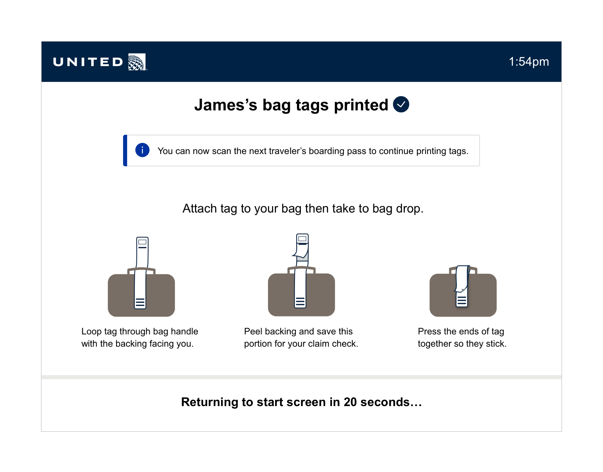
The "printing in progress" screen needed to indicate that printing had been initiated, demonstrate how to tag a bag, and provide directions on what to do next.

The "printing completed" screen needed to indicate that printing had been completed, provide directions for multi-passenger reservations, and communicate the screen time-out.
The proposal for a touchless check-in process quickly gained traction at United for a few reasons.
We could implement a safer check-in process, which would accommodate our customers’ new needs, without spending money on new devices.
We’d immediately reduce the risk of spreading the virus in our lobbies and reduce customer anxiety.
The vision also aligned with United’s long-term goal to increase usage of its mobile app.
The process created meaningful work at United during a period of loss, abandoned projects, and uncertainty about the future.
We launched an initial proof of concept at four airports: Chicago, Dallas, Orlando, and Boston. Our test was simple. We configured a single bank of kiosks to “touchless mode.” The other kiosks remained in full-service “touch mode” (also known as the legacy kiosk application).
Because customers already could use the app and website to check in and check bags, we didn't need to make any other changes. We could simply reconfigure the kiosks to run the new application.
We had several questions we wanted to answer during the proof of concept. We planned to get answers mostly through qualitative feedback. We didn't have the resources to send formal researchers to the airports, but we were able to train our front-line agents and set up a feedback loop. They'd be our boots on the ground, report observations to their management who would then send it back to our program manager. As far as quantitative data went, we set up analytics on the kiosk to track our error states.
This is what we learned:
Do agents and customers find the new, touchless experience valuable?
Airport management reported positive impressions from both customers and their front-line staff.
Did customers understand how to initiate the transaction and have success scanning their boarding pass?
Customers had no trouble initiating transactions.
What other observations did front-line agents have about how customers were interacting with the kiosk?
While our agents didn’t track the number of customers using the new kiosks, they noticed customers arriving without having checked in. They said those customers didn’t mind checking in/adding bags with their phones while standing at the kiosk.
Our agents wished there weren’t two types of kiosks. They wanted the customer to be able to switch into the legacy touch mode if they preferred. This would eliminate the need for agents to direct each customer to a different type of kiosk and also eliminate the need for new signage to label different types of kiosk banks.
What percentage of customers arrived at the kiosk with a boarding pass but without having checked their bags?
Of all eligible travelers, only 35% were prepared to use the touchless kiosk. This meant that 65% of users had either not checked in or not checked their bags before arriving at the airport. As noted above, however, those customers didn’t mind completing the process on the mobile app right there in the lobby.
We gathered all the data from the POC and set out to make a second iteration to address the problems we discovered.
The changes we made to the kiosk centered around the start screen. We addressed agent concerns by combining the touchless kiosk and legacy kiosk by adding an option: "I want to use full-service touch mode instead". We decided to have the default setting of the kiosk as touchless, but give the option to opt out.
In addition, we added a QR code to give faster routing to check-in for the customers arriving unprepared.
Also, at this point I focused on cleaning up the visual design. I standardized the hierarchy of the screen by combining the previously competing headlines, "Touchless check-in" and "Print bag tags here" into a single page title, "Touchless bag tag printing". I also gave clearer instructions by labeling the steps needed to complete the process, making the content easier to digest. The page also brings in the decorative elements implemented in a legacy kiosk rebrand that was executed earlier this year.

We also added new functionality to make agent overrides touchless. United uses "agent overrides" when an agent needs to assist a traveler at the kiosk. When a customer encounters this, a static override screen appears and can only move forward with the help of an agent. There are several variations of these, but the most common are when customers check bags that are "special": wheelchairs, strollers, skiis, etc.
To make this experience touchless for the agent, we eliminated the interaction with the touchscreen and replaced it with the scanning of their badge to approve the verification.


We updated the mobile app to encourage more passengers to complete check-in and check their bags before arriving at the airport. We emphasized the “check bags” button. It had been hidden at the bottom of the page, so we increased the hierarchy. We added “trip tips” to the app homepage to drive awareness of the new check-in process.


We also saw a big opportunity on the app boarding pass. If customers are scanning their boarding passes and receiving the error that they have not checked their bags, could we just add the call-to-action, "Check bags" on the boarding pass?
This ended up being a very simple solution. We already had a data field built into the UI of the boarding pass that could display this CTA. We also could easily route to the check bags functionality within check-in and reroute immediately back to the boarding pass. A quick win -- simple to implement, high impact.

We launched the second iteration in all domestic airports (220 stations) in mid June. The first international airport, London Heathrow, followed in July.

United was first to market with the concept. American followed suit in late July. The speed of our release to production is noted as impressive in the airline industry. It's a testament to the talent of everyone who worked on the project.
“United Airlines’ Chief Digital Officer, Linda Jojo, recently noted the company has now rolled out a touchless bag tag printing solution at its kiosks at four airports. This is something that is completely driven by the app and 100% did not exist even as a concept less than two months ago. That’s fast in airline sense, certainly. It may not seem so quick but for an airline to roll out a new digital technology in two months is really really impressive.”
- Seth Miller, Author at APEX | Airline Passenger Experience
The new touchless kiosk application was featured in several well-known outlets:


One of the biggest take-aways from this project is encapsulated in a quote from a managing director of customer experience at United:
“We were able to take existing hardware that is all around the globe, and we were able to do the software conversion and convert that to a totally new experience.”
- Maria Walter, Managing Director of Customer Experience at United Airlines
Innovation does not depend on flashy technologies. We didn't build a new AI personalization engine or launch sexy new kiosk devices. We leveraged what we already had to create a brand new experience, which adapted to the rapid change in customer, agent, and human needs caused by the pandemic.